My Role
Lead Product Designer
(6-month contract)
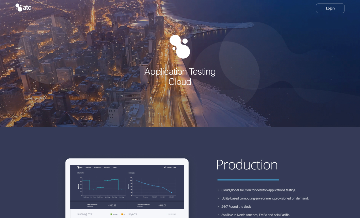
Cloud Infrastructure for Global Engineering Teams.
Lead Product Designer
(6-month contract)
Led the end-to-end redesign of JPMorgan’s internal cloud provisioning platform, transforming a fragmented legacy platform into a data-driven dashboard. Owned the full design lifecycle during this 6-month initiative, partnering closely with internal DevOps teams and engineering stakeholders to modernise the infrastructure self-service experience.
Impact
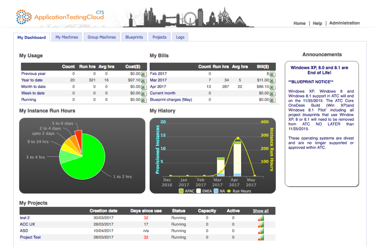
Context: The existing platform was a legacy utility that prioritised backend function over frontend usability. It was a static, text-heavy interface that hid critical controls behind information, forcing engineers to navigate documentation just to perform simple tasks like running a virtual machine. The cognitive load was so high that developers were struggling to complete basic provisioning workflows.
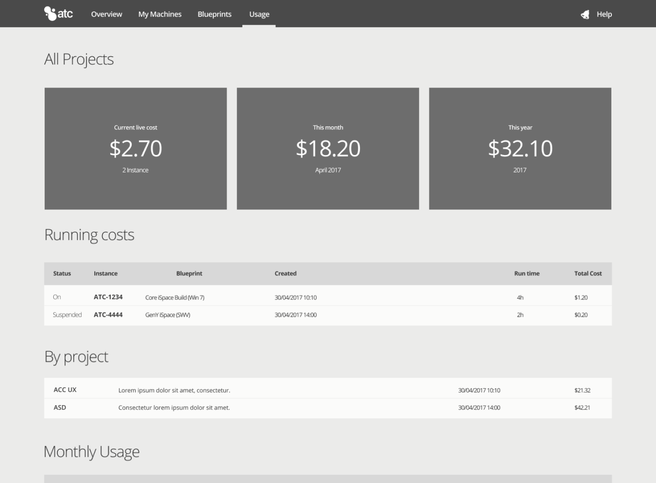
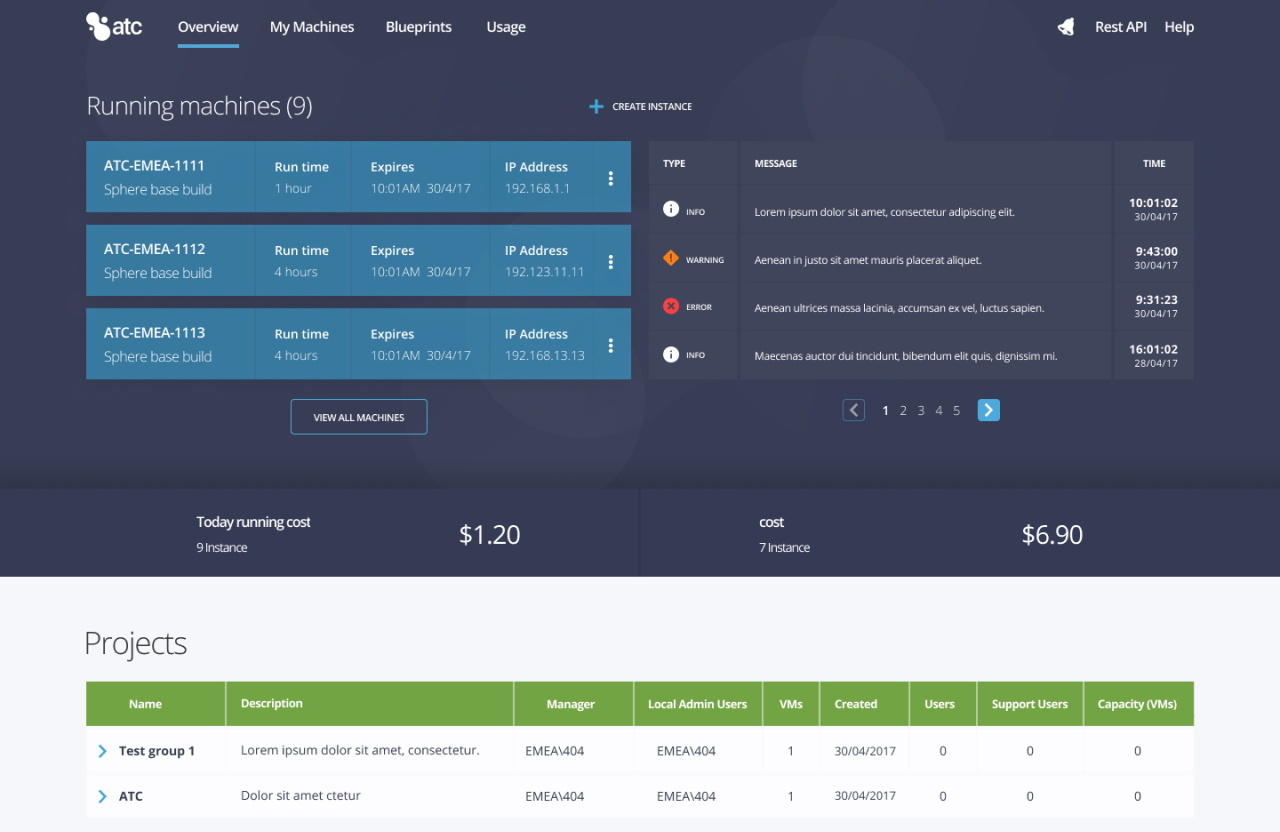
Problem: The interface lacked any form of data visualisation, meaning managers were struggling to understand global VM capacity and spending. Without a clear view of active resources, the organisation faced uncontrolled costs and wasted infrastructure, as there was no easy way to identify or reclaim unused assets.
To ensure we solved the right strategy, I led a discovery phase involving interviews with internal engineering teams, DevOps leads, and infrastructure managers. We analysed the friction between developers and Infrastructure Managers to design a single self-service platform that could satisfy both opposing requirements.
Key Insights
During the early definition phase, the backend engineering team initially pushed to expose all configuration parameters to ensure maximum technical control. However, our user research revealed that this cognitive overload was the primary cause of provisioning errors and abandoned requests.
Workshop: We agreed to minimise cognitive load by introducing a step-by-step VM creation wizard. Instead of manual entry, we utilised pre-defined templates to automatically populate complex technical fields, ensuring users could provision compliant servers without deep infrastructure knowledge.
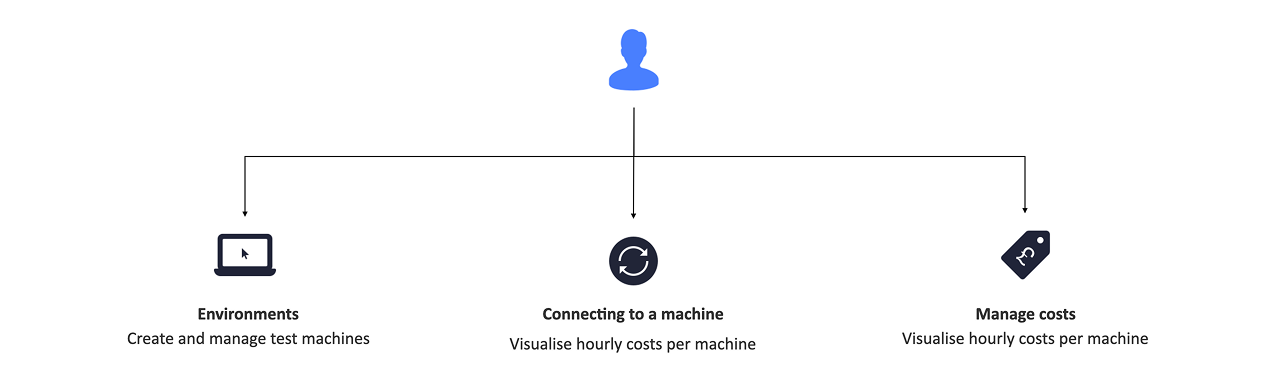
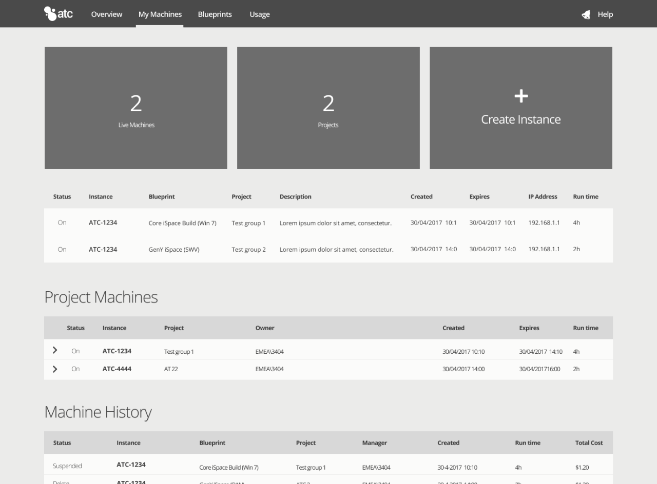
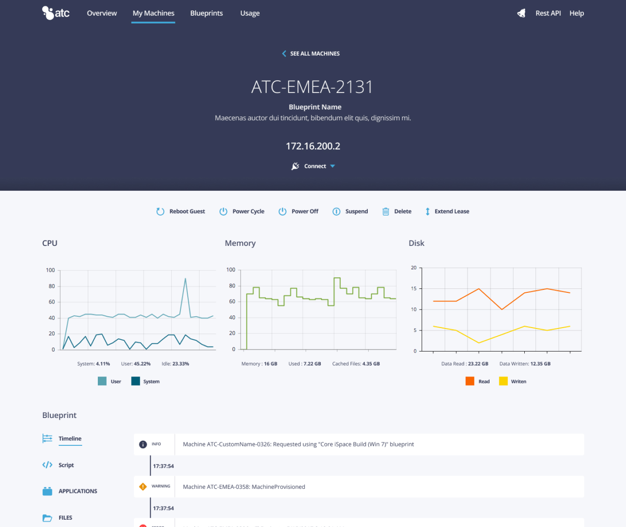
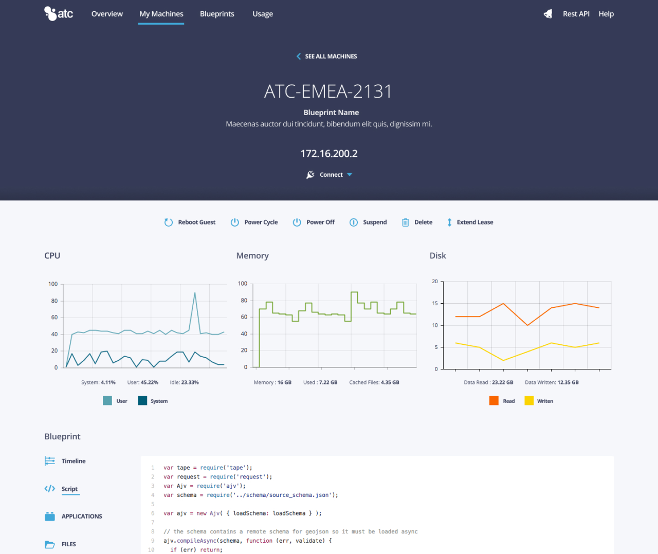
Result: We defined a strategy to transform the dashboard into a command centre. This included immediate visibility into running machines and real-time costs. Another requirement needed was a detailed machine view that allowed users to monitor performance metrics (CPU/Memory) and execute critical actions like reboot, removing the need to log into a separate console.
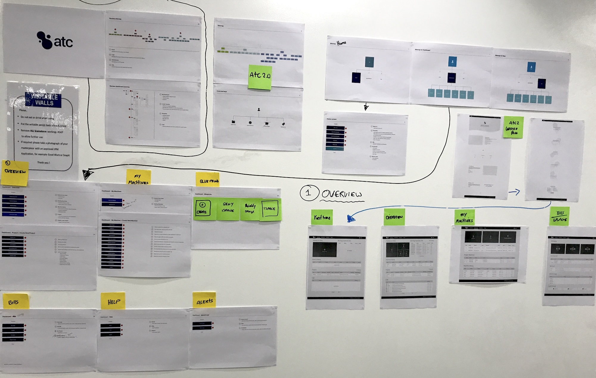
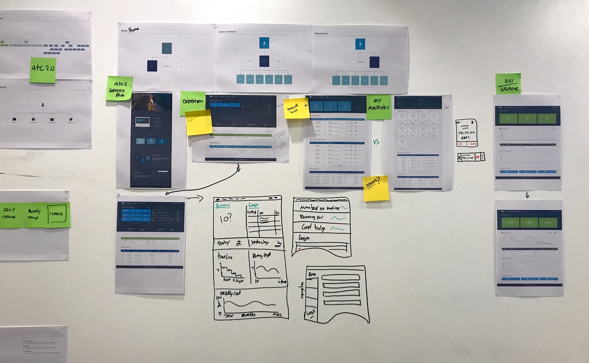
I initiated the design phase with large-scale whiteboard sessions to visualise the conditional steps of the new Wizard. This allowed the engineering team to review how debug the front-end before we designed a single pixel.
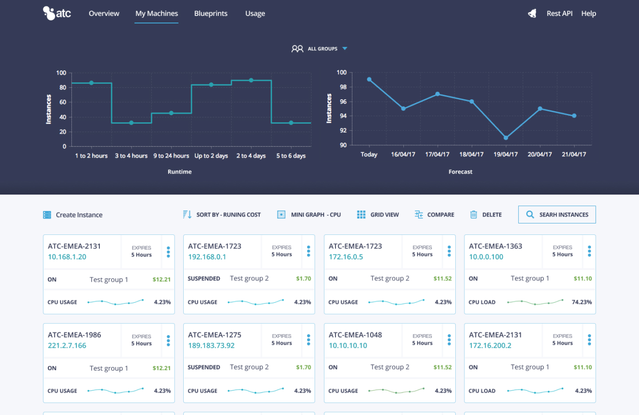
We moved into low-fidelity wireframes to map out the density of the dashboard. The goal was to test the information architecture and how an engineer identifies active instances and their real-time costs at a glance without digging through tables.
Before committing to full development, I established a feedback loop with internal engineering teams to test the new interaction model. We moved from static wireframes to clickable prototypes to validate that the new dashboard for DevOps users.
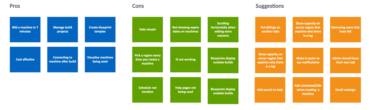
Data Density
Early testing revealed that users rejected our initial table designs. The excess columns forced horizontal scrolling, which hid status information such as failed or pending off-screen.
Fix: I introduced a grid + list toggle, allowing users to choose their preferred view. In the grid view, I prioritised status indicators and IP addresses, ensuring machine health was visible at a glance without scrolling.
Expiried VMs
Engineers complained that the legacy interface buried expiry dates. This led to frustration when machines were automatically deleted because the user didn’t realise their lease was ending.
Fix: Display expired status timestamp to the top-level card hierarchy. This visual prominence ensured users could see upcoming deadlines immediately and extend leases to prevent data loss.
VMs Capacity
Users frequently encountered errors after submitting a request because they were trying to provision servers in regions that were already at max capacity.
Fix: I designed preventative constraints in the creation wizard. If a region was full, it was visually disabled with a capacity indicator. This prevented errors before they happened, saving users from filling out forms for unavailable resources.
We successfully validated and deployed a self-service flow that transformed the bank’s infrastructure deployment. While the fixed 6-month contract duration limited the collection of long-term performance, the immediate post-launch metrics confirmed a significant shift from reactive to proactive resource management.
Designing for internal users is fundamentally different from building for the open market. Users had to use this tool to do their jobs, so my goal was to minimise friction. DevOps engineers preferred structure rather than hiding data. The challenge was balancing high data density with scannability, ensuring experienced users had immediate access to complex metrics without cognitive overload.
As a contractor on a strict 6-month timeline, I couldn’t spend indefinatly time on research. Learning how to prioritise reusable design standards and ensuring the engineering team could continue building on top after my contract ended.